Wednesday, November 16, 2011

Ice Cave!

As many of you may know, Sara and I had our first baby at the beginning of the month.  Dorian James Hall, arrived a week ago today.  God has really blessed us with such an amazing little guy.

Dorian's Baby Stats!: 9lbs 3oz. , 21" long , 41 weeks cooking, arrival at 8:18pm on 11/9

  We are so glad he is here!  Sara did an amazing job, she was in labor 63 hours.  She is healing well and doing good.  Below are a few pictures of the little guy.


Sara and I both thought, what better way to celebrate our baby, then to make him an awesome room.  So below is my latest set design :)

The Ice Cave!


Sara and I set out to make Dorian's new room an Arctic Wonderland.  He has Penguins, Orca Whales, and Ice burgs on his walls.  Sara did a great job coming up with all the scenes and painting them all.  She did pretty much all of the painting except for the cave.  The whales and penguins look so realistic.  I don't think the photos do them justice.


Since, my part was mostly the cave, I will delve into that.  To start I made an arc with 2 layers of 1x2 lumber cut at angles.  It is shown below.


   I added 2x4 studs that ran down at various lengths to make the vertical structure.  You can see them in the photos to the side and the plot above too.  To give the cave some rigidity, I put spacers at the bottom of the studs.  I had to cut these to match the angles the studs were at.

Lastly I covered it all in chicken wire for the next step.


For the next step, I covered the entire structure in paper mache.  Paper mache is very easy to make, just rip newspaper into strips and cover it in a glue (I used a mix of 2 cups flour, 1/2 cup water).  After letting this initial layer dry, I put on a second coat.  This made a decent structure for the cave, but it was obviously paper mache.  

To make it look more realistic I added a few layers of paper mache glue and drywall mud.  It retrospect, I would have only  used drywall mud.  It is much easier to work with and dries better.  Below are some pictures of this part of the build.  This part took the longest, probably 50 hours.


I sponged on some grey and white paint to give it a bit more texture.  Above you can see the final product.
As with any good set, it is only as good as the lighting that accompanies it.  Having this wonderful knowledge, we decided to get I cove LEDs for Dorian's cave.  Here are some pictures of me learning how to set them up and what they look like.


I wired the system up to a wireless network too, so know you can control the LEDs from any computer via Color Kinetics QuickPlay Pro.


Well that is all.  Best of wishes from our family.  I am looking forward to a very busy Christmas, but will update my blog when I can.

Saturday, October 29, 2011

Lyman Easter Site 2011

The past few Easters at Northland, we have experienced overflow crowds for our Easter services.  To help with this we decided to setup a temporary site as a direct extension of Northland.  We did simultaneous services with broadcast feeds running in both directions.  There were solos at Lyman (our site) and our full band at our main site (Longwood).  It was a quite impressive.  This is something we have done in the past, but lighting has never been a large part of it.  This year we changed that.  We really wanted to create an atmosphere similar to our main sanctuary.  Below is how we were able to accomplish this.


Lyman High School (our temp site) has a 700 seat auditorium.  As you can see in the pictures, there are some nice reflective panels on the ceiling.  It is a good room with a lot of possibilities.


Our normal Easter services are a large production.  So with our limited staff and limited room availability, we were forced to load-in the day before.  The 4 days before were focused on building and programming our lighting in the main sanctuary. (Below)


So with the limited time and limited crew, we decided to go with a soft set and a 90% moving light rig.  Using the moving lights enabled us to spend less time setting up less lights, and more time getting dynamic and fitting looks through programming.


The theme of our Easter service was a story of redemption.  We used picture frames to show how each of our lives is a picture of a story of redemption.  You can see the full service at http://www.northlandchurch.net/media/easter2011/ .  Below are a few more pictures of the service at Lyman.


To help tie in with our service we built a Cross of picture frames in both buildings.  Below is a picture of the one we built for Lyman.  We spent $35 for all the frames at area thrift stores and attached them to a 2x2 frame that we painted black.


Since Easter is a celebration of Christ's resurrection, we wanted the "set to have a warm feel".  To do this we covered the existing Black drape with a layer of sheer fabric from Rose Brand.  We used the red gold Shimmer Organza, which is an amber sheer with flakes of metallic sparkle in it.  It disappeared when not lit, but took light very well too.  It gave a nice texture to the nearly empty stage.  You can really tell how dynamic the fabric could be used (or not used) in the next few photos.


Almost all of the designs I do rely heavily on lighting (like any good, self-respecting set should).  However, this one did particularly heavily.  We used an assortment of Mac 2000 Profiles, VL2500 Washes, and Mac 101s.  The VL 2500s gave us a good solid color wash for video backlight, the Mac 2ks gave us a lot of great texture and cyc lighting, and the Mac 101s gave us some really great beam looks.


I think it was a pretty amazing feet to setup and program such a versatile rig in 2 days, especially with the previous 3 days being 55 hours of loading-in, setting up, and programming in the main sanctuary.  I will leave you with my 2 favorite pictures.  The start of the load-in and one of my favorite looks.  It is amazing what the Lord can do with your skills if you submit to him.  


Monday, October 24, 2011

You did WHAT! with the front light?

This design is all about front light.  I know for me, this is a game changer.  We used only Par 16's (Birdies) for front light.

We were doing an acoustic service.  The birdie front light gave a real intimate atmosphere.  They were place on DSR and DSL and crossed.  The shadows on the wall made for a feeling like you were in a small room with candle light (with less fire hazard).  We also added some Ikea lamps to give it some thing  in the back.


Tuesday, October 18, 2011

Screens a-la truss

So, this is a pretty cut and dry set.  We built a box of 12" truss with 2- 10' sticks, 2- 4' sticks and 4 corner blocks per side.  To line the center we hung two layers of Viole Sheer cut to size.  We then lit them with 2 American DJ pars and during certain songs our moving lights.  We also lined the trusses with some Par 56's we have.  A lot of time we used them more as a surface to reflect, than to light anything up.  Simple set that only took about 2 hours to build and looked pretty good.


Tuesday, September 27, 2011

Christmas Camp '08


These pictures are form Christmas Camp '08.  We brought a small lighting package to light a rustic camp in north  Georiga.  We used the lighting during the worship sessions, a talent show, and also a party on New Years eve.  We used 5 techno beams and 18 Versa Bar LEDs.

We found a creative diffuser for our Versa bars.  A bent piece of white computer paper and some gaff tape.  It worked amazing and gave us a Versa tube type look.  We have since tried it with Colorblasts too, and it has worked ok.


Tuesday, September 13, 2011

Truss Proscenium

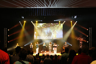
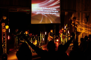
As a true lighting guy, I love to use lighting as a set!  Below are is a set I did based around lighting as a set.  A little creative light placement and a small amount of time (2 people and 4 hours).  This set is compromise of 4- 14' silver trusses and 24 par cans.  We also added 2 16' towers in the back and moved our 2k washes onto them.  The par trusses made a cool layer of depth and matched our proscenium.  The boundaries the truss created changed the whole atmosphere of the room.  It reflected light well and looked really cool.  The amazing lighting in the pictures below was done by Bradley Nolff, our resident 17 year old lighting genius.  Enjoy!

,Steven